PBSA Rebooking Print | Fill Rooms Before Christmas
Why email alone rarely fills next year's rooms, and how phased print across lifts, laundries and doors supports student rebooking.
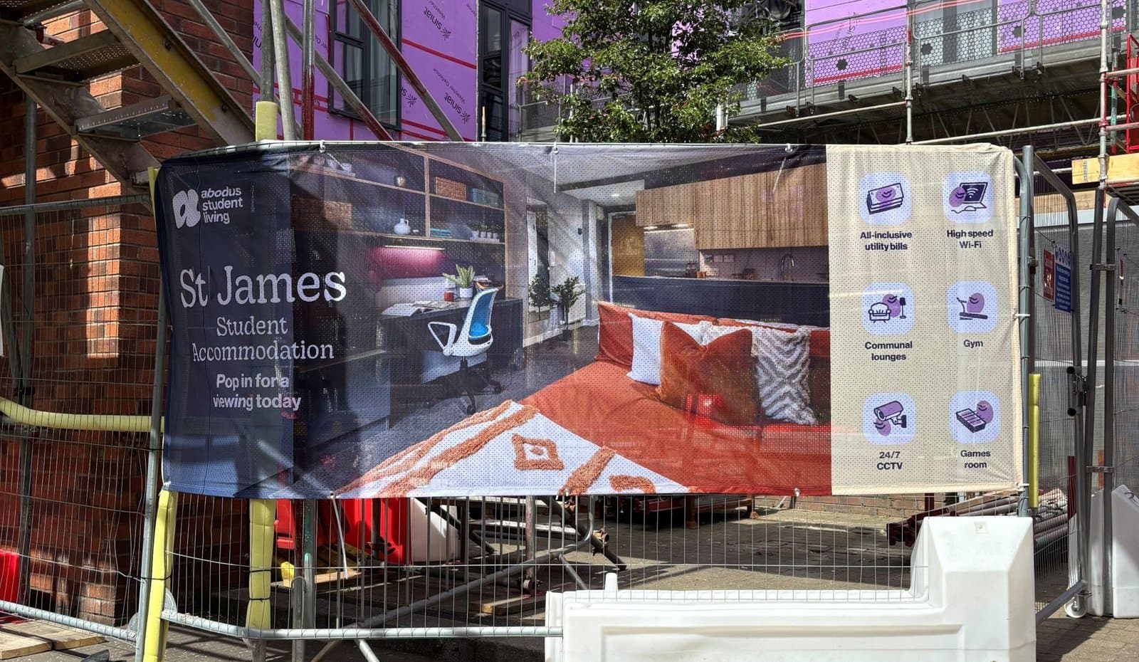
Rebooking season in purpose-built student accommodation is short, loud and almost entirely digital. The portal opens in late October, the email goes out, a reminder follows a fortnight later, and then the leasing team watches the dashboard and hopes. By February somebody is asking why occupancy for next September is sitting behind last year.
Here's the line we hear every autumn, usually with a shrug: "Print doesn't work on students. They're on their phones."
It's one of the most repeated beliefs in the sector, and it's wrong in a specific, expensive way.
The myth, stated plainly
Students live online, so rebooking is an email-and-social job. Printed flyers go straight in the bin, posters get ignored, and any budget spent on physical collateral would do more work as paid social.
There's a grain of truth in there, which is why it keeps going. A single A5 flyer pushed under 400 doors, with no follow-up and a deadline date buried in six-point body copy, genuinely does very little. We've printed those jobs. Somebody ticks the box, nobody tracks the result, and the following year the verdict is "print doesn't work". The flyer wasn't the problem. One isolated touch with no sequence behind it was never going to shift a decision that a resident makes in a flat kitchen at eleven at night, usually alongside four other people who are all waiting to see what everyone else does first.
The comparison being made is also the wrong one. You're not bidding against TikTok for the attention of a stranger. Your audience sleeps in your building.
What actually happens in the building
Walk a resident's Tuesday. Out of the flat door, along the corridor, into the lift, past reception and the parcel room, out. Back at six, into the kitchen. Down to the laundry at some point in the week, into the gym or the study lounge if the scheme has one. That's a dozen contact points you own outright, with no media cost and nobody else allowed to buy the space.
Email gets opened by the organised ones. Everyone else meets your message while they're standing in front of a tumble dryer with nothing else to look at, which is exactly when a bored person reads whatever is on the wall.
The pattern we see across schemes that get this right is not dramatic. Leasing teams stop chasing non-responders and start answering questions at the desk instead, because residents arrive already knowing the deadline and the offer. The email still does the transactional work. Print is what makes the email land on someone who has seen the message four times already.
The surfaces that earn their place
Not every wall deserves a graphic. These consistently pull their weight:
- Lift doors and lift interiors. Captive audience, thirty seconds at a time, several times a day. Specify a polymeric self-adhesive vinyl with a removable adhesive and a matt laminate, and agree a planned removal date with the supplier. Micron weight and polymeric film alone won't save you. Clean lift-off from painted steel depends on the adhesive system and how long it's been up, so a permanent adhesive left on a lift door for eight months is how you end up paying for a respray.
- Mirrors in gyms and communal shower blocks, with cut vinyl around the edge rather than across the face. Wet rooms are the catch here. Steam gets under a cut edge and lifts it within weeks, so keep graphics out of direct splash zones, wet-apply and squeegee properly, and round the corners on any cut shape. Square corners peel first.
- Laundry rooms. Eight minutes of standing about with nothing to do. A3 posters in existing frames, swapped three times across the campaign.
- Kitchen noticeboards in cluster flats, which is the one room the whole flat shares and the room where group rebooking conversations actually happen.
- Reception and the parcel collection point, where a pull-up or a window graphic catches people who are already queueing.
- Door drops on something with a bit of heft, A6 or A5 on a 350gsm uncoated board. Uncoated takes a handwritten-style message well and survives being stuck to a kitchen wall with Blu Tack.
Floor graphics. They need a laminate with a genuine slip rating, so ask your supplier for a figure rather than the word "anti-slip" on a spec sheet. R10 under DIN 51130 is the usual minimum people work to for an internal floor, and plenty of self-adhesive floor film sold as suitable doesn't carry a rating at all. They also scuff badly in entrance lobbies within a few weeks of wet shoes. In a big atrium with polished concrete they look excellent. In a 1.2m-wide corridor, the same money does more as a second round of posters.
QR codes, and doing them properly
A QR code is the difference between a campaign you can measure and a campaign you argue about in March.
Print a unique code per property, and where you can, per placement. The lift code and the door drop code can land on the same rebooking page through different tracked links, which means that when the finance director asks what the print did, you answer with numbers rather than instinct. We've seen the measurement change budget splits for the following year more than once, usually not in the direction anyone expected.
Sizing is where most of them fail, and it's governed by scan distance rather than by any fixed millimetre rule. Work to roughly a tenth: the code wants to be about one tenth as wide as the distance it's read from. Held in the hand at 300mm, 25 to 30mm is fine. On a lift door panel read from arm's length, 60mm. Across a lobby at two metres, you're into 200mm, and a 40mm code on a reception banner is decoration rather than a link. Add module density to that. A long URL stuffed into a small code produces tiny modules that a two-year-old phone camera gives up on in a dim corridor.
| Issue | What to do |
|---|---|
| Code too small for the viewing distance | Size at roughly 1:10 against scan distance, then test at that distance |
| Code sits in the fold or bleed | Keep it 10mm clear of any trim or fold line |
| Low contrast | Dark code on a light panel. Reversed-out white on a brand colour scans badly in low light |
| No fallback | Print a short, memorable URL underneath it |
| Dead link once the offer ends | Use a redirect you control so you can repoint it mid-campaign instead of reprinting |
One more, and it costs nothing. Test the scan in the actual lighting of the actual lift before you sign off 40 panels. Glossy laminate plus LED downlighters produces glare that beats a phone camera, which is why we specify matt on anything carrying a code.
Urgency has to be printed in phases
A single poster hanging there from October to March stops being seen by about week three. Residents filter it out the same way you filter out your own fridge.
Campaigns that work change three or four times across the season, same look, escalating message:
- Launch. "Love it here? Stay another year." Warm, no pressure, up the week the portal opens and paired with the door drop.
- Early bird. The offer phase. Fixed rent, reduced deposit, a free week, whatever leasing has signed off. Deadline date in large type, not in the small print.
- Group and referral. "Keep your flat together." Usually sits around a common room event, because flatmates decide together or not at all.
- Last chance. Stark, dated, short. Different enough that people notice the change without it looking like a different building.
Four phases means four smaller print runs instead of one big one. The thing that really drives the cost of that is the number of separate artwork files you need rather than the number of sheets coming off the press, so build one template with swappable panels and a locked masthead at the start of the season. Changing a date field on an approved template is cheap in studio time. Redesigning a poster in December because nobody planned phase three is not.
Multi-property rollouts are where this gets messy
If you run eight schemes, the temptation is to let each site order its own posters.
You already know how that goes. Three properties use last year's logo, one orders A2 when every frame in the building is A3, somebody's QR points at a landing page that was taken down in August, and the brand guidelines PDF has been forwarded so many times it's now a screenshot. Then the reprints land on the central budget anyway.
The fix is a templated campaign with locked brand elements and editable fields for property name, offer, deadline and the property-specific code. Site teams order what they need from an ordering portal, artwork stays right, and nobody is firefighting in week two. It's dull administration that saves a lot of January.
When we'd tell you not to bother
Print isn't the answer everywhere, and we'd rather say so before you commit a season's budget.
If your scheme is 90 postgraduate studios on a single-year taught intake with almost no rebooking history, the money belongs in new-let marketing. Those cohorts go home. No amount of lift vinyl changes a visa end date.
If the building has a live maintenance problem that the whole resident WhatsApp group is complaining about, a poster asking people to stay another year reads as a wind-up. Fix the lifts, then print about the lifts.
And if the budget only stretches to one thing, make it the door drop plus laundry and lift posters. Skip the merchandise. A tote bag is a decent thank-you for someone who has already signed, and a weak substitute for being in front of someone who hasn't.
What to do before the portal opens
Work backwards from the portal launch date. Have artwork approved and with us well ahead of the week you want graphics up, because installation in a live building means working around residents, deliveries and whichever lift is out of service that week. Agree all four message phases at the start. Decide who is physically putting posters into frames, then tell that person, in writing, before they find out from a box in reception. Build and test the QR links while the artwork is still editable.
Then count your surfaces properly. Walk the building with a camera and a tape measure, photograph every spot a graphic could go, and write the sizes down. A good share of the delays we see on PBSA campaigns trace back to a lift door that turned out to be 50mm narrower than the drawing said.
If you've got a rebooking campaign coming up and you'd like a second pair of eyes on the artwork, the phasing or the site list, send it over and we'll tell you what's workable and what you'd be wasting money on.
Got a project like this?
Send the brief or the artwork over and we'll tell you honestly what we'd do with it.
Talk to Us