Exhibition Stand Printing | Kit That Lasts
An exhibition stand printing checklist that starts with the van and the cupboard, so you buy kit that still works at show three.
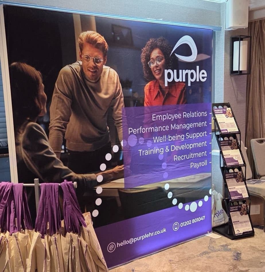
Most first-time exhibitors buy in the wrong order. Big spend on the back wall, then a panic order three days out for a table cloth, some leaflets and a pull-up banner. Six months later the wall is in a cupboard with a crease across the logo, the leaflets carry last year's prices, and the whole lot gets replaced before the next show.
That cycle is avoidable, and it's a buying problem more than a design problem. The question worth answering before you order anything is which parts of the kit will still be usable at show three, and which parts carry a date, a price or a named person's mobile number and so have to be printed fresh every time. Get that split right at the start and the second show costs a fraction of the first, because you're only paying for the bits that changed.
If this were our brief, here's how we'd reason it through.
Start with the van and the cupboard
The first question we ask an exhibitor is rarely about size or budget. It's how the kit gets to the hall, and where it lives for the eleven months it isn't at a hall.
If the answer is "in the back of a Golf, driven by whoever is manning the stand", that rules a lot out straight away: big rigid panels, heavy wheeled cases, anything over roughly 1.5m in its packed length. A Transit and a warehouse with racking opens the options right up, and modular aluminium starts to make sense. Neither answer is wrong, but they buy different stands, and we'd rather find that out before the quote than after the first knock-down.
Storage does more damage to exhibition graphics than shows do. A roll-up cassette stood upright behind a filing cabinet for eight months comes out fine, because the graphic is protected inside the housing and under tension. The same graphic loose in a cardboard tube, in a damp lock-up, with a box of merch resting on it, comes out with a dent across the middle that you cannot iron, steam or hang out. Dye-sublimated fabric is far more forgiving: fold it, wash it at 30 degrees, and once it's back under tension in the frame the fold lines drop out within the hour. Printed PVC does the opposite. It takes a permanent crease at the fold and hall lighting rakes across it and finds every one.
Buy kit that packs into its own hard case, and graphics in a material that forgives being folded.
What we'd actually buy
The core spend goes on a fabric system. A tension-fabric pop-up, or a straight or gently curved frame with a dye-sublimated stretch polyester skin around 260gsm, finished with a stitched silicone edge that beads into the channel. It packs into a bag, one person can build it, and there are no panel joins to line up.
One caveat that catches people out. At 260gsm, a single-layer skin is slightly translucent. Put a window, a fire exit or a bank of hall lights behind it and you'll see the frame bars shadowed through the graphic, plus a general glow that washes out your colour. If the back of the stand is open or backlit, specify a blockout-backed fabric or a double-layer skin with a liner. It costs more per square metre and it's the difference between a wall that looks printed and one that looks like a lampshade.
Why fabric over a laminated panel system? Panels are sharper at close range, and nobody reads a back wall from 400mm. What a visitor takes in from across an aisle is a block of colour and a headline, and fabric delivers that without the join lines and without the scuffed panel edges that show up after two builds.
The rest of the list, roughly in order of what we'd buy first:
- A counter with a swappable front graphic. The shell lives for years, the front changes when the offer does.
- One roll-up banner, graphic printed on grey-back PVC around 500 micron so it hangs flat and doesn't ghost with a spotlight behind it. One, not four.
- Something that lifts your name above head height, if the hall regulations and your stand space allow it.
- Flooring, if you're on bare concrete. A printed mat or a foam tile system changes how long people stay standing on your stand.
That's a stand. The rest is consumables or nice-to-haves.
Shell scheme rules that bite
Half the problems we see on build day come from the exhibitor manual nobody read. Worth checking before artwork is signed off:
- Height limits. Inside a shell scheme you're usually capped around 2.5m, and anything taller needs organiser approval plus a finished, dressed reverse so your neighbours aren't looking at bare frame.
- Fixings. Most organisers won't let you screw, nail or stick anything to shell walls, and you get charged for damage at breakdown. Use the scheme's own clip-in or hook-and-loop panel system, or bring freestanding kit that doesn't touch the walls.
- Fire retardancy. Fabrics, flooring and any drape usually need to be certified flame retardant, and the hall or organiser can ask to see the certificate during build. No certificate, and it can be pulled off the stand. Ask your printer for it and keep a copy in the case.
- Actual dimensions. A "3m" bay is often 2.95m between uprights, and the usable width inside the posts can be less again. Measure from the floor plan, then confirm on the manual.
The reusable and the disposable
Splitting the kit into two buckets before you order is what stops the waste. Anything with a date, a price, a job title or a named contact on it belongs in the disposable bucket and should be designed to be cheap to reprint.
| Item | Realistic life | Reprint driver |
|---|---|---|
| Fabric pop-up skin | Many shows, years | Rebrand or damage |
| Frame, case, counter shell | Years, if not dropped | Physical damage |
| Counter front panel | 1 to 3 shows | Campaign or offer change |
| Roll-up banner graphic | 2 to 5 shows | Kink, scuff, message change |
| Foamex or Dibond info panels | Several shows | Content change |
| Literature | One show, usually | Everything |
| Branded clothing | Multiple shows | Staff turnover, sizing |
The counter front is the row that surprises people. It sits closest to the visitor, it carries the specific offer, and it dates faster than anything else on the stand. Order the counter with a graphic you can swap and you never pay for the shell twice.
Graphics that read from ten metres
A hall is a hostile place for a design. Competing colour on every side, mixed colour temperature overhead, bodies blocking everything at eye level, and a visitor who gives you a second and a half while walking past with a coffee.
The band that does the work sits roughly between 1.4m and 2.4m off the floor. Below 1.4m gets blocked by furniture, staff and other visitors' backs. Above 2.4m only gets looked at if you've already earned the glance. Put the single thing you want remembered in that band, at a size that looks ridiculous on your monitor. Our working rule for a 3m wall is a headline cap height of at least 100mm, and 150mm if the layout can take it. Four or five words, not a sentence. We've had exhibitors send back-wall artwork with a full paragraph of body copy across the top, and it never gets read in a hall.
A few things we'd hold the line on:
- Contrast wins over brand palette. A mid grey secondary colour on white vanishes under hall lighting.
- Keep the bottom 400mm of a fabric wall visually quiet. It creases at the frame foot and gets hidden by a counter anyway.
- Reversed-out type on fabric needs weight. Dye-sublimation into stretch polyester wicks slightly, so white text below about 4mm cap height at final size starts losing its counters. If you're working at quarter scale, that's 1mm on your artboard, which is roughly 3pt.
- One typeface, two weights.
On resolution, judge it by viewing distance rather than by the word "large format". A back wall read from three metres or more is happy at 100 to 150dpi at final size, and supplying a 3m graphic at 300dpi just gives everyone a file that takes ten minutes to open. A counter front, a rigid info panel or a site plan that someone reads at 500mm is a different job and wants 200 to 300dpi at final size. What no resolution setting fixes is source photography. A stock image that looks clean at 90mm across a brochure page turns into visible mush at 2m tall, and there's nothing to be done at the RIP.
Where we would not spend
Giveaways, on a first show, beyond something cheap and genuinely useful.
We've printed a lot of promotional gifts, and the ones that earn their keep are the ones that stay on a desk. Everything else is in a bin before the car park. If the show is new to you, you don't yet know the audience well enough to commit to 500 units of anything, so go light on show one, watch what people pick up and pocket, then buy properly for show two.
We'd push back on literature quantity too. Take enough for the visitors you'll have a real conversation with, plus a margin. A tower of 1,000 brochures on a 3m by 2m stand reads as a stand nobody has visited, and you'll carry most of them home to a stockroom where the price list quietly goes out of date. A short-run brochure you reprint per show, or a single-sheet leaflet pointing at something maintained online, does more work.
And don't buy a bigger system than your space. A 4m curved pop-up jammed into a 3m bay looks worse than a 3m straight wall with air around it.
The spares box
Occasional exhibitors skip this and regret it on build day. Make one box, keep it with the stand, restock it after every show. In ours: spare frame feet and base pins, gaffer tape and low-tack masking tape, cable ties, a multi-tool, a lint roller, blank labels, spare lamps if the kit has them, and a pack of adhesive hook-and-loop. Add printed build instructions with photos taken during the first build, because whoever assembles it at show four won't be the person who did show one.
On spare graphics, our honest view: don't hold a spare back wall, do hold a spare roll-up graphic if the banner is doing real work. Cassettes are where damage happens. A finger through the film, a kink from retracting it at an angle, a scuffed bottom edge off a concrete floor. The hardware usually outlives two or three graphics, and a replacement graphic for an existing cassette is a much smaller line than a new unit.
When rigid board still wins
Fabric is our default rather than a rule. Rigid panels earn their place when the content is dense and read up close, or when the stand doubles as a working display. A house builder taking site plans and elevations to a home show is better off with 5mm Foamex or 3mm Dibond on easels or in a frame, because that's fine linework people lean in on. Same for a veterinary practice running before-and-after imagery, or a park operator with a site map visitors trace with a finger.
Be honest about how those panels travel, though. Rigid board wants a flight case, or at minimum a corrugated wrap with corner protection, and every unprotected journey takes a bit off the life. Dibond shrugs off a knock. Foamex dents if you look at it wrong. If the same panels are going to five shows, spend on the aluminium composite and the case.
The pattern that works
The exhibitors who stop replacing their stand every year tend to have done the same thing. They bought less hardware than they were first quoted, spent the difference on the parts that touch the visitor, and kept the changeable content on cheap-to-reprint items: a counter front, a short-run brochure, a fresh banner graphic in the old cassette. Three shows in, they're paying for print rather than for kit. The frame, the case and the fabric skin are all still doing their job, and the money goes on the message instead.
If you've got a stand space booked and a rough idea of what goes on the wall, send over the dimensions, the exhibitor manual and whatever artwork exists. We'll tell you what we'd keep, what we'd cut, and what will still be usable at your third show.
Got a project like this?
Send the brief or the artwork over and we'll tell you honestly what we'd do with it.
Talk to Us