Careers Fair Literature | Make Them Stop
Why some recruitment stands get queues and others get walked past, and how to fix your careers fair literature, banners and handouts.
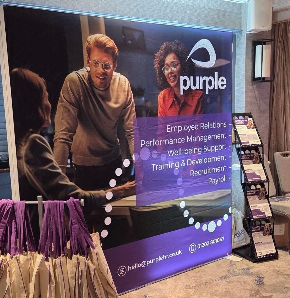
You've done the fair. Nine hours in a sports hall or a draughty exhibition centre, a table, a roller banner, 400 brochures printed and 380 carried home again. Meanwhile the stand two along had a queue most of the afternoon and they didn't look like they'd spent more money than you.
It stings, because the kit wasn't the problem. The banner printed beautifully. The brochure was 170gsm silk, properly designed, nicely folded. The problem was that nobody walking past could work out, in the second and a half they gave you, why they should stop.
That's the whole game at a careers fair. You are not competing on information. You're competing for a pause.
What's actually going wrong
Walk a careers fair as a candidate rather than an exhibitor and the pattern is obvious within ten minutes. Most recruitment stands say the same four things: the company name, a strapline about people, a list of sectors, and the words "we're hiring". All of it is true. None of it gives anyone a reason to break stride.
The second issue is physics. A graduate walking the aisle is reading your stand from roughly three to five metres away, at an angle, with people in front of it. If your headline is set at 80pt on a 2m roller banner, it reads at about the size of a paperback title from that distance. Legible if you stare. Nobody stares.
Third, and this one's self-inflicted: the stand is designed to be read when you're standing in front of it, which is the one moment you don't need it, because by then a human being is talking to them.
So you end up with a stand that works perfectly for people who have already decided to stop.
Fix the top metre first
On a careers fair stand, everything above about 1.4 metres is your billboard and everything below it is your conversation. Treat them as two different jobs.
The billboard gets one idea. Not a strapline plus three bullets plus a logo lock-up plus a QR code. One idea, in type big enough to read across the aisle, with enough clear space around it that the eye lands on it rather than bouncing off a wall of content.
What counts as one idea? Something a candidate can act on or react to:
- A number they can't ignore ("47 live roles in Dorset this week")
- The thing they're actually anxious about ("No experience? Start Monday.")
- A question that demands an answer ("What's your notice period?")
- The sector, enormous, if the sector is the draw ("Engineering jobs. That's it. That's the stand.")
Generic is the enemy. "Connecting great people with great companies" is a sentence that could sit on any of the 60 stands in that hall, and a candidate's brain filters it out before they've finished reading it.
A rough rule we use when setting artwork for exhibition graphics: your main headline cap height wants to be around 100mm minimum on a roller banner, more like 150mm plus on a 3m pop-up. That usually means six words at most. Yes, six. Write the headline, then cut it in half, then cut two more words out. It'll be better.
The literature problem
Here's the uncomfortable bit about careers fair literature. Most of the brochures handed out at a fair are read in the bin.
Candidates take them to be polite, carry them round for an hour, and dump the lot before they get to the car park. A 16-page A5 brochure full of your values and your office culture costs real money and gets perhaps four seconds of attention before it's assessed as "generic recruiter" and binned.
What survives the walk home is literature with a job to do after the fair. Specifically:
A one-page handout with live roles on it. Dated. Printed in short runs on digital so you can change it between events. A candidate who's interested in warehouse work in Poole will keep a sheet that says warehouse work in Poole. They will not keep a brochure about your 20-year heritage.
Credit-card-sized cards also do well, because they go in a pocket rather than a bag, and a pocket gets emptied at home instead of in a bin on the way out. We've printed plenty of these for recruitment clients on 400gsm with a matt laminate so they survive a week in a coat.
If you want one substantial piece, make it a sector guide rather than a company brochure. Interview questions for care roles. What an engineering apprenticeship actually pays attention to. Salary bands by trade in your region, if you genuinely have that data and will stand behind it. That's the thing someone keeps, and your contact details are on it.
Short runs beat big runs here
The instinct is to print 1,000 of everything because the unit cost drops. Then the roles change, the dates go stale, and you're handing out a sheet with three filled vacancies on it at the next fair. Digital print on shorter runs costs more per copy and less overall, because you're not pulping 600 sheets twice a year. Litho makes sense for the evergreen piece you'll use all season. Split the job.
QR codes: useful, frequently wasted
A QR code on a careers stand is worth having, and most of them are set up badly.
The common failures, all of which we've seen on artwork that came in for print:
| What goes wrong | What to do instead |
|---|---|
| Code printed at 25mm down at table height | 80mm minimum, at eye level on the banner, with contrast |
| Links to the homepage | Links to a page built for that fair, with the roles listed |
| No reason to scan it | Label it with the payoff: "Scan to see today's 47 roles" |
| Tracking added after print | Use a UTM or a short redirect URL so you can count scans per event |
| Dark code on a dark brand colour | Keep the quiet zone clear and keep contrast high |
The redirect point matters more than people expect. If the code resolves through a short URL you control, you can change the destination after the banner is printed. Event moved, landing page renamed, campaign ended: you change it on your side and the 2m banner in the van stays valid. Hard-code the full URL into the artwork and you're reprinting.
And a landing page that's just your careers page is a wasted scan. Build one page per event, list the actual roles, put a phone number on it and a short form. If someone scanned at 2pm and heard nothing until the following Thursday, you've lost them to whoever rang back that evening.
Stand layout, and why the table is the problem
Most recruitment stands put a table across the front. It's a barrier. You're standing behind it like passport control and candidates have to approach you across a desk, which is exactly the posture most of them are nervous about.
Turn it. Push the table to one side as a surface for literature and giveaways, and stand in the open with a clipboard or a tablet. Simple change, noticeably different footfall.
Beyond that, a few things that genuinely change how a stand performs:
- Something at floor level that reads from the side. Aisle traffic approaches side-on, so a side-facing banner or an A-frame catches people your front graphic misses entirely.
- One physical thing to do. A whiteboard question, a role-matching card, a spin wheel if your brand can carry it. An activity gives the shy candidate a reason to be at your stand without having to open with "so, um, are you hiring?"
- Height. A 3m pop-up or a tall flag reads from the entrance, and the entrance is where people decide which half of the hall to walk first.
- Branded clothing that matches the stand. Sounds trivial. It isn't. Four people in identical polos read as a company; four people in their own jackets read as a table.
We print a lot of pull-up banners for recruiters and the single most common artwork fault is a design that's beautiful on screen at 25% zoom and illegible in a hall. Print your proof at A4, pin it to a wall, walk four metres back. If you can't read the headline, nobody at the fair will either.
What you can sort yourself, and what needs us
Your side of the line: the message. Nobody else can decide what makes your roles worth a candidate's afternoon. Work out the one thing, write it in six words, and get the live-roles content ready in a form you can update between events.
Our side: making it legible, durable and consistent. That means setting type at the right scale for the viewing distance, supplying artwork at the right resolution for the finished size (large format doesn't need 300dpi at full size, and a 300dpi 3m file will simply be painful for everyone), choosing stock that survives a term of fairs in a van, and keeping colour consistent between the banner, the handout and the polo shirts. Brand red going pink on the banner while the brochure is spot-on is the sort of detail candidates don't consciously notice and do unconsciously register as sloppy.
If you're running a circuit of fairs with multiple branches ordering their own kit, the web-to-print portal is worth the setup. Locked templates for the roles sheet and the pull-up banner, branch details and live vacancies as editable fields, everything else fixed. Branch managers order what they need, nobody retypes the strapline, and head office stops policing artwork by email. It's not worth building for two events a year. For a team doing twenty, it pays for itself in saved arguments.
When to pick up the phone
Call before you design, not after. The point where it's cheapest to fix a careers fair stand is while the headline is still a sentence in a document. Once the banner's printed, your options are living with it or paying twice.
Also call if the stand's been printed and isn't working. Often the fix is one new banner and a redesigned roles sheet rather than a whole new kit, and you can usually keep the hardware.
Send over your current artwork, a photo of the stand in situ if you have one, and the dates of your next fair. We'll tell you what to keep, what to bin and what's actually stopping people from stopping.
Got a project like this?
Send the brief or the artwork over and we'll tell you honestly what we'd do with it.
Talk to Us